For decades, critics have predicted the end of the written word: “No one reads anymore! No one writes anymore!” Yet from birth certificates to gravestones, from T-shirts to text messaging, the written word—and thus reading—is woven into the fabric of our everyday lives.
Throughout history, we have used the written word to record and preserve who we are and what we care about: possessions, laws, commitments, ideas, and memories. Words and characters, once impressed in clay, written on papyrus, and printed with ink, are now manifest in pixels of light.
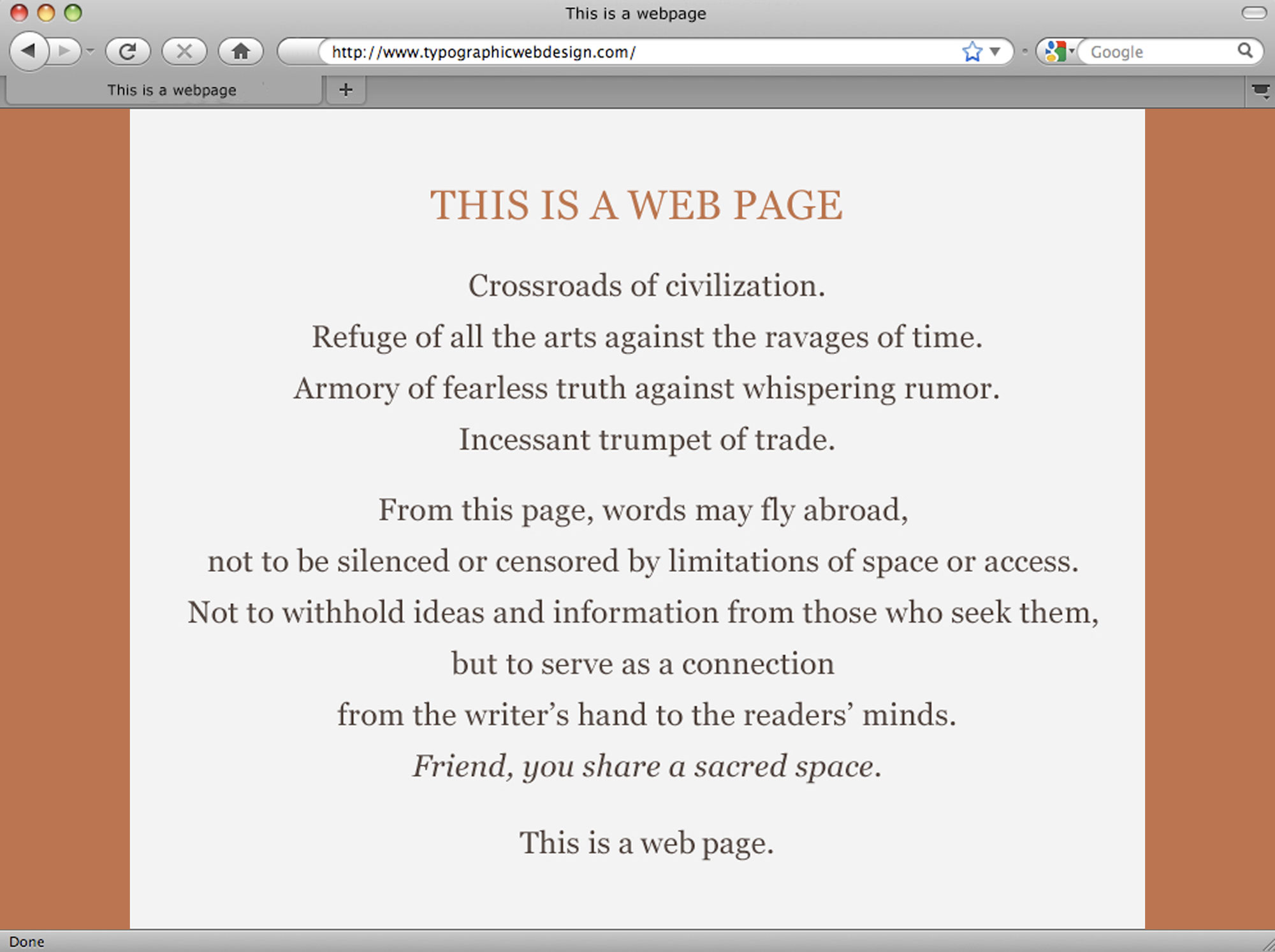
Information and ideas fly abroad, carried by words and characters now manifest in pixels of light. With respect to Beatrice Warde who wrote and designed the original This is a Printing Office broadside in 1932.
As Jessica Helfand wrote in Sticks and Stones Can Break My Bones but Print Can Never Hurt Me: A Letter to Fiona on First Reading “The End of Print” in 2000, “… words are ideas just waiting to be read. And reading will never die. Reading is your ticket to the world.” People read. They seek a connection to their community, answers to their questions, lessons to augment their skills, and new ideas to influence their lives.
People may not participate in sustained reading the way they used to (or the way we think they used to), but people read. They text, tweet, and post on Facebook. They search for things they need or want to know. They get lost in stories. People read what is important to them.
Redefining Reading
If we define reading only as a sustained and literary activity, if we acknowledge only one kind of reading, then we measure ourselves against a fabricated truth. We design around something we say people don’t do. We ignore their activity; we exclude their needs and desires.
The truth is there are different ways to read, and they are all valid and important. As typographers, we can support them all.
People read in three ways:
Scanning with purpose is scanning down or across a text, jumping from section to section, looking for a specific piece of information. The reader may glance only at the first letter or word of each section, dismissing incorrect matches and moving on.
Casual reading is skimming over a text, reading sentences here and there (the first sentence of each paragraph, the caption, the pull quote) to get a general idea and flavor of the text.
Sustained reading is engaged reading. It includes pleasure reading (pursued for its own sake) and reading for understanding. Readers slow down, read the entire text, and may go into a trance-like state.
As typographers, our first responsibility is to our readers. Our most important job is to help our readers find, understand, and connect with the words, ideas, and information they seek.
Our second responsibility, then, is to honor the content. We must help to clarify and share the meaning of the texts people read.
What Readers Need
When scanning with purpose, readers need a left edge down which to scan. They need words set in a font they can read easily and quickly.
They need information to be “chunked” for them, visually separated or grouped, so they can skip ahead if what they seek isn’t in the current section. They need these chunks laid out in a consistent manner, so if they skip to the next section, they know what to expect.
When engaged in casual or sustained reading, eye movement should feel comfortable. Readers shouldn’t have to slow down to decipher words set in hard-to-read fonts (or font sizes). Readers need a comfortable line length to avoid eye fatigue, and a generous line height to promote horizontal motion.
Casual and sustained reading benefit from chunking, too. Knowing when and where sections start and end gives readers a sense of the overall structure of a text. Chunking makes the text more manageable, providing readers with entry and exit points.
These are but a few of the things readers need. Understanding how people read leads to readable text blocks. Readable text blocks become the cornerstone for building a grid. Levels of hierarchy create emphasis. Captions and pull quotes become counterpoints to the text and create visual rhythm. Horizontal and vertical spacing create visual tension. Before you know it, a design develops, built upon your knowledge of how people read.
Design for Pleasure
We are pleasure-seeking creatures and appreciate fine things: beautiful colors, textures, and shapes; contrasts in rhythm; layers of complexity. But fine things cannot compensate for an unpleasant reading experience.
Instead of asking, “What can I do with this space?” ask, “What does a reader need from this text?”
Instead of asking, “What new font am I dying to use?” ask, “What does the text need from me?”
Instead of starting with visual inspiration, read the text you’ll be working with. Design a pleasurable reading experience, and the other fine things will follow.